Today is world sketch note day
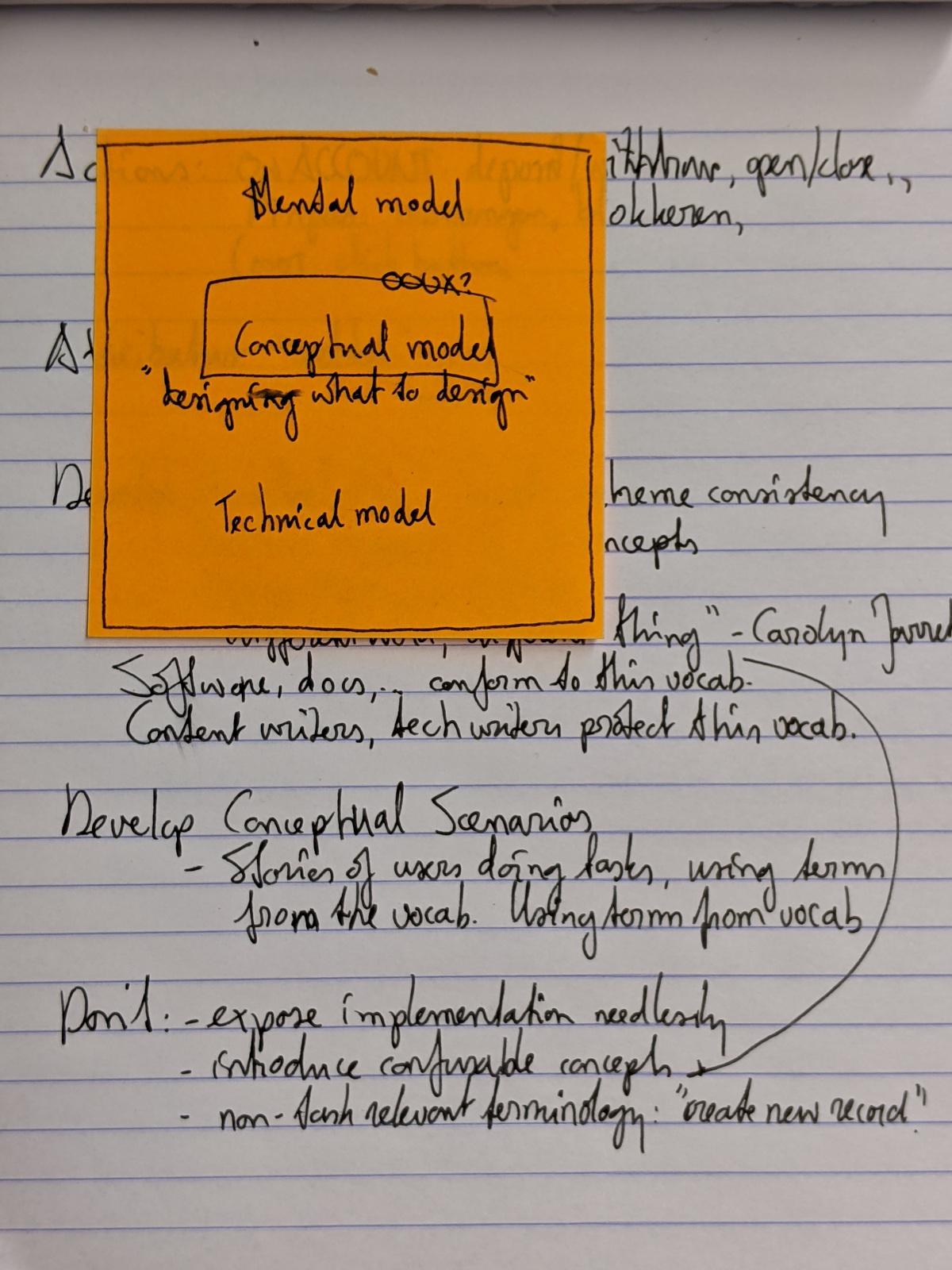
I don’t often find myself adding pictural elements to notes I take when reading. When I do, it’s mostly simple arrows, boxes or other diagrammatic marks to indicate relative importance and relationships. For example, these are notes I took working through this video on conceptual models. (Which are another kind of sense-making visualisations in themselves, but not now, not now.)

For me, the most natural situation for making sketchnotes is while listening to a talk or presentation in a conference setting (remember those? etc.). Other than with video’s and podcasts, you can’t really pause or rewind the speaker and that in itself forces you to pay attention.
At the same time, the speed of delivery is slow enough to keep up with with drawing and writing.
Looking back at some of the drawings I made that could be called sketchnotes, it’s clear I don’t aim for a complete and linear summary of all that was presented.

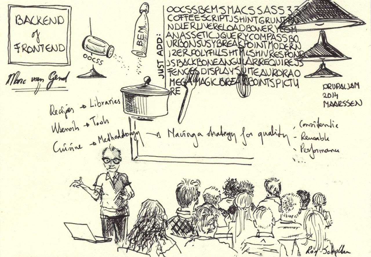
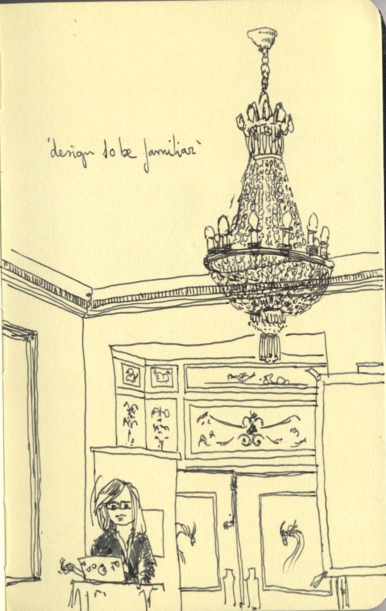
I often start with drawing elements of the actual environment: speaker, audience, details of the architecture. This way of drawing has more to do with concentration, it doesn’t seem to interfere with listening. A more observational version of ‘doodling while on a call’. It can make for interesting contrasts between image and text.

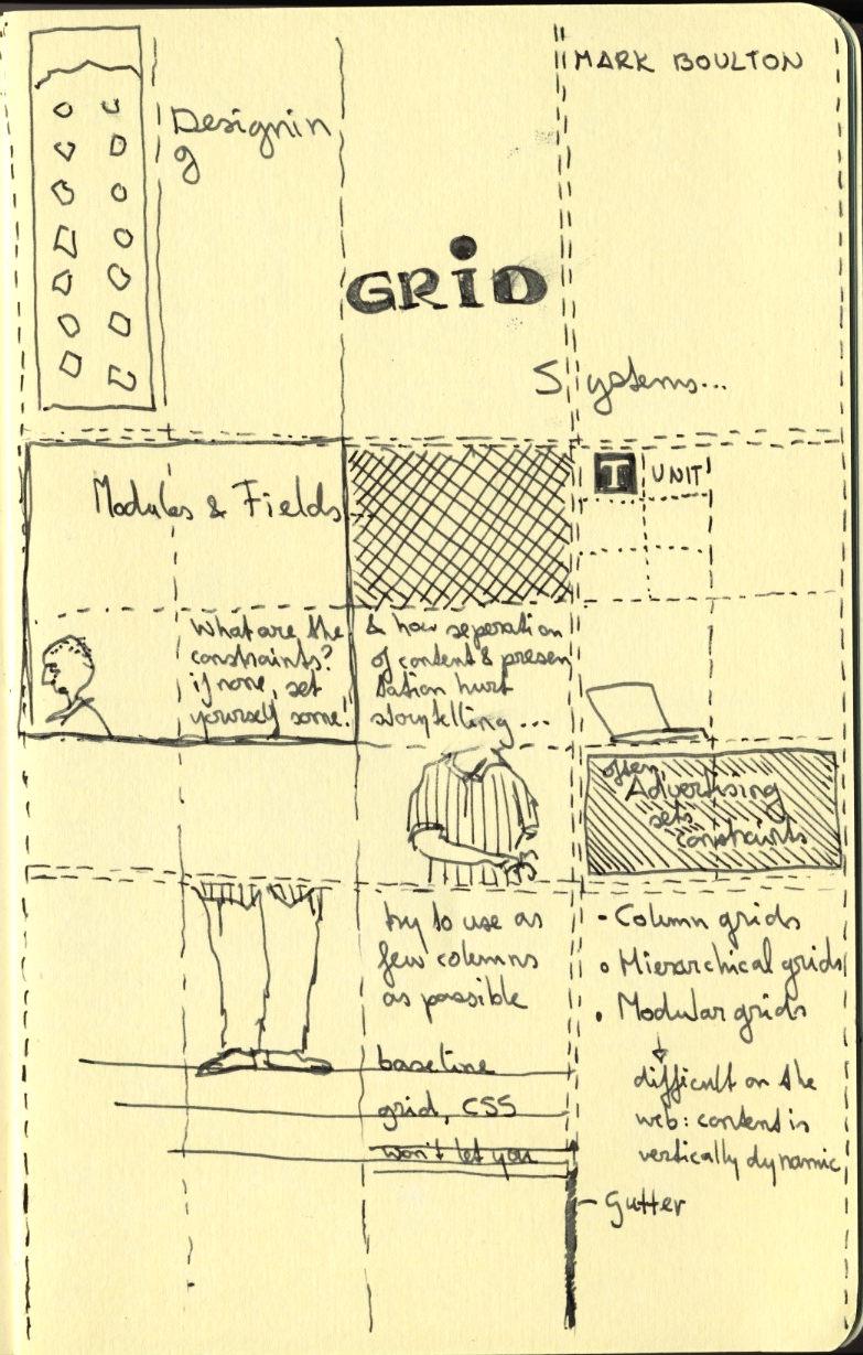
These drawings then mix visual impressions of the real-life scene with the core ideas being discussed. In the more succesful ones that combination of elements communicates the argument being presented by the speaker.

In cases where I made sketchnotes during multiple, related talks I sometimes scan the individual drawings and created a digital collage to bring the main points and observations together. The monochrome line art of the drawings and text provide a lot of room for interesting connections and overlaps.

Find these and some more sketchnotey drawings here.
_
11/365