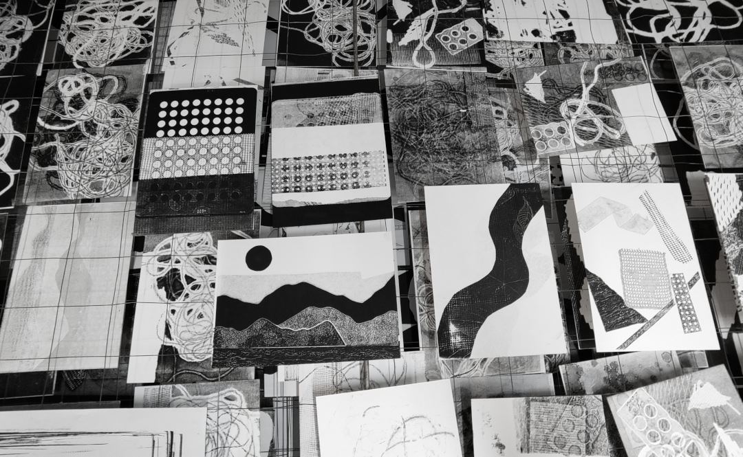
I'm testdriving Joplin for the more structured “projects and tasks” part of note taking. Can sync through Nextcloud. Nextcloud seems to be offered more often as a specific syncing option besides the usual dropboxes and iclouds etc.
Erfgoed: van het verleden, in het heden, voor de toekomst is het traditionele kader. Maar voor wie, wanneer en hoe in welke toekomst wordt zelden concreet gemaakt. Terwijl je door middel van erfgoedprocessen juist vorm geeft aan mogelijke toekomst(en): “assembling, building and designing future worlds”.
In Heritage Futures, Comparative Approaches to Natural and Cultural Heritage Practices analyseren en beschrijven de auteurs erfgoedconservatie als een set creatieve, dialogische, meer-dan-alleen-menselijke betrekkingen tussen personen, objecten, plaatsen en praktijken. Door erfgoed vooral te beschouwen als een set aan processen worden de toekomst-vormende aspecten van erfgoed beter zichtbaar. De gegeneraliseerde processen zijn:
Communiceren – gebruiken, interpreteren, tentoonstellen, verspreiden, waarden uitdrukken
Mogelijke/alternatieve toekomsten vormgeven door middel van erfgoedpraktijken is per definitie speculatief en emergent. Het creatieve potentieel van deze benadering wordt aan de hand van vier thema's in kaart gebracht:
Diversiteit – in biologisch, cultureel en linguistisch opzicht.
Overvloed – “coping with overflow”
Onzekerheid – hoe kan het ongewisse van een toekomst als creatieve/innoverende factor werken?
Transformatie – Als proces ipv object centraal staat, (hoe) kunnen processen van vergankelijkheid onderdeel worden gemaakt van de erfgoedpraktijk?
Momenteel onderzoek ik de vorm & inhoud Middeleeuwse verluchte initialen (hier, hier). Van daaruit is een variatie op het dagboek-format ontstaan. Inhoudelijk grotendeels hetzelfde, maar de snelle tekening is veranderd in een verluchte initiaal. De initiaal is de beginletter van de te noteren quote. De voorstelling in de initiaal hoeft vooralsnog niet te relateren aan de quote zelf, maar neemt een van de gedaan, meestal gezien items als vertrekpunt.
Neemt op die manier veel meer tijd in beslag natuurlijk, maar een goede manier om al doende de opbouw van de verluchte initialen te bestuderen.
_
Sold another couple of bird prints this week. Only four left of the Blue tit and the House sparrow. Working on a design for the Jay. I think I solved the problem of that finely striped black and blue patch on its wings.
_
Started reading Designs for the Pluriverse by Arturo Escobar. Only at the introduction so far, but already some beatiful, meaningful and incisive phrases. “All creation is collective, emergent and relational.” “The endless, ceaselessly changing weave of life on which all life depends.”
Verluchte initialen bevatten interessante vormen van tekst-beeld combinaties. Daarmee zijn het treffende voorbeelden van de onderlinge verbondenheid van vorm en inhoud.
In informatie-technologie, en dan vooral in digitale communicatie langs meerdere kanalen/media wordt gestreefd naar een zo strikt mogelijke scheiding van vorm en inhoud (search “separation of content from presentation”). Een zo neutraal mogelijke notatie van de inhoud maakt het mogelijk om de presentatie ervan aan te passen aan de specifieke context waarin deze plaatsvindt.
Dit principe maakt veel mogelijk maar lijkt ook een aantal zaken uit te sluiten. Welke scheiding tussen vorm en inhoud kun je maken in het geval van een verluchte initiaal? Waar eindigt de letter, waar begint het beeld? Welk deel van de letter is inhoud, welk deel is decoratie? Waar houdt de een op en begint de ander? Is het zinvol om in dit geval deze scheiding uberhaupt aan te willen brengen?
Is het niet juist interessant dat beiden tegelijkertijd het geval zijn? De ene component heeft de andere nodig om zelf als zodanig geduid te kunnen worden. De ene component bepaalt tegelijkertijd mede de indentiteit/ervaring/expressie van de andere componenten.
Inhoud want vorm, vorm want inhoud?
form follows function, or
form because function,
function because form?
presentation because content,
content because presentation?
Goldfinch, organisational knowledge management and that remarkable absence of the true representation of nature
It was the week of snow and cold and ice in The Netherlands. I walked instead of cycled to the studio each day. Takes a bit longer of course, but those 25 minutes are good for switching the home/work/home contexts.
_
Finished the edition of twenty of the European goldfinch print. The first two have already been sold as well. Cool, it turned out well indeed. Graphically a very interesting bird with clearly marked areas of color. Not one to start out with, but at thirty designs in, it was time to tackle this one.
_
I sent out the first actual newsletter with printmaking updates to my small list of subscribers. In dutch, but it you're so inclined, you can subscribe at the bottom of the page.
_
Besides illuminated intials and margin decorations and illustrations, there's also the numerous patterns medieval book illuminators used for filling solid areas of color/space. Here's another example. Want to start catalogueing these in some way, or find out whether that's been done already.
_
Mister George Charles Williamson wrote this sentence in 1911 for the entry on miniature painting in the Encyclopedia Brittanica and it captures very well what I find so fascinating about medieval imagery: “Landscape, such as it was, soon became quite conventional, setting the example for that remarkable absence of the true representation of nature which is such a striking attribute of the miniatures of the middle ages.“
In Calligraphic Space no. 3 this abstract piece is one of the more interesting results to me. I'm looking into the history of the codex, the illuminated manuscript and within that, the illuminated initial. It's a specific format where text, image and decoration intermingle.
I want to work within similar parameters for the next phase of the Calligraphic Space programme. Not only on paper, but on the screen as well.