36 days of type 2021

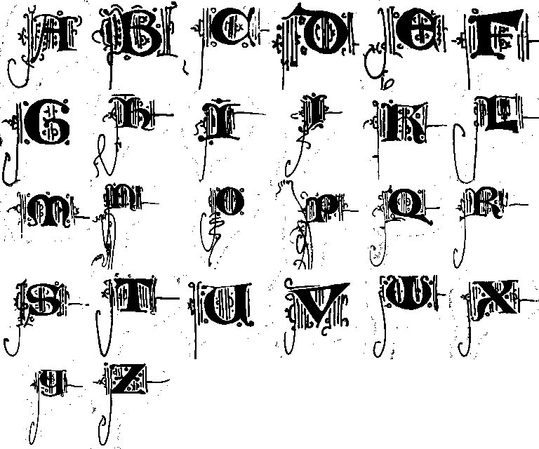
My series for 36 days of type is derived from the versal letters in https://digi.vatlib.it/view/MSS_Vat.lat.160.
I’m analysing the basic elements, patterns and compositions that make up the specific hand of this particular scribe. The plan is to do this for a few different manuscripts to better understand how these are constructed and build a library of ingredients and rules to eventually create my own variations.
I find the decorative line work that adorns these letters strangely touching. Sometimes elaborate and skillful, but just as often somewhat crude and basic. When progressing through a given codex, you can often see how the scribe’s interest and enthousiasm tapers of. The initials in the first parts of the book tend to be more elaborate and smooth, with the linework getting more hasty and less complex further on.
What was it that made this specific approach the way these versal letters were decorated?