Verluchte initialen in middeleeuwse manuscripten waren eeuwenlang het toneel waarop de relatie tussen tekst en beeld uitgespeeld werd.
Gedurende de meer dan duizend jaar tussen de late oudheid en de uitvinding van de boekdrukkunst werd op dit relatief kleine canvas op vele manieren de grens tussen letter en tekening dan weer vervaagd, dan weer aangescherpt. In perioden waarin meer op de klassieke oudheid werd teruggegrepen werden symbool en figuur duidelijker van elkaar gescheiden. Zodra het christelijk geestelijk leven en lokale tradities weer de overhand kregen vloeiden tekst en beeld meer in elkaar over.
George Charles Williamson schreef in 1911 voor de encyclopedia brittanica over miniaturen in middeleeuwse handschriften het volgende: “Landscape, such as it was, soon became quite conventional, setting the example for that remarkable absence of the true representation of nature which is such a striking attribute of the miniatures of the middle ages.”
De meer schematische weergave van de fysieke wereld bood meer ruimte voor verknopingen van figuren met letters, van letters met decoratie, van decoratie met figuren, etc. Deze ambiguïteit ligt aan de basis van een uniek kalligrafisch-picturaal repertoire.
In een tijd waarin inhoud opgehakt wordt in informatie, informatie opgesplitst wordt in data en het spreadsheet het voornaamste ontwerpinstrument is, biedt deze ambiguïteit ook nu een welkom tegengeluid: tussen taal en teken ligt de ruimte voor betekenis en kan uitdrukking worden gegeven aan het onzegbare.
Blackletter resources by Dr. Dan Reynolds has a short history and classification of blackletter scripts plus an extensive list of books and online resources for more information.
Rubrication design examples, a gallery of typographic and graphics design examples of rubrication, a classic pattern of using red versus black for emphasis.
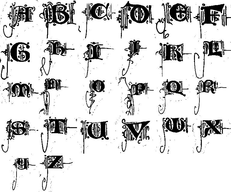
Lombardic letters
Wat zijn eigenlijk lombarden?. 'Lombarden, paragraaf- en semiparagraaftekens in Middelnederlandse epische teksten', Willem Kuiper, 1980
KPS Fonts, 74 free fonts divided in four groups: paleographic, typographic, interpretations, inventions. The paleographic collection represents a timeline of western scripts, from the second to the eightteenth century.
I'm analysing the basic elements, patterns and compositions that make up the specific hand of this particular scribe. The plan is to do this for a few different manuscripts to better understand how these are constructed and build a library of ingredients and rules to eventually create my own variations.
I find the decorative line work that adorns these letters strangely touching. Sometimes elaborate and skillful, but just as often somewhat crude and basic. When progressing through a given codex, you can often see how the scribe's interest and enthousiasm tapers of. The initials in the first parts of the book tend to be more elaborate and smooth, with the linework getting more hasty and less complex further on.
What was it that made this specific approach the way these versal letters were decorated?
Verluchte initialen bevatten interessante vormen van tekst-beeld combinaties. Daarmee zijn het treffende voorbeelden van de onderlinge verbondenheid van vorm en inhoud.
In informatie-technologie, en dan vooral in digitale communicatie langs meerdere kanalen/media wordt gestreefd naar een zo strikt mogelijke scheiding van vorm en inhoud (search “separation of content from presentation”). Een zo neutraal mogelijke notatie van de inhoud maakt het mogelijk om de presentatie ervan aan te passen aan de specifieke context waarin deze plaatsvindt.
Dit principe maakt veel mogelijk maar lijkt ook een aantal zaken uit te sluiten. Welke scheiding tussen vorm en inhoud kun je maken in het geval van een verluchte initiaal? Waar eindigt de letter, waar begint het beeld? Welk deel van de letter is inhoud, welk deel is decoratie? Waar houdt de een op en begint de ander? Is het zinvol om in dit geval deze scheiding uberhaupt aan te willen brengen?
Is het niet juist interessant dat beiden tegelijkertijd het geval zijn? De ene component heeft de andere nodig om zelf als zodanig geduid te kunnen worden. De ene component bepaalt tegelijkertijd mede de indentiteit/ervaring/expressie van de andere componenten.
Inhoud want vorm, vorm want inhoud?
form follows function, or
form because function,
function because form?
presentation because content,
content because presentation?
In Calligraphic Space no. 3 this abstract piece is one of the more interesting results to me. I'm looking into the history of the codex, the illuminated manuscript and within that, the illuminated initial. It's a specific format where text, image and decoration intermingle.
I want to work within similar parameters for the next phase of the Calligraphic Space programme. Not only on paper, but on the screen as well.